
 Tweet
Tweet
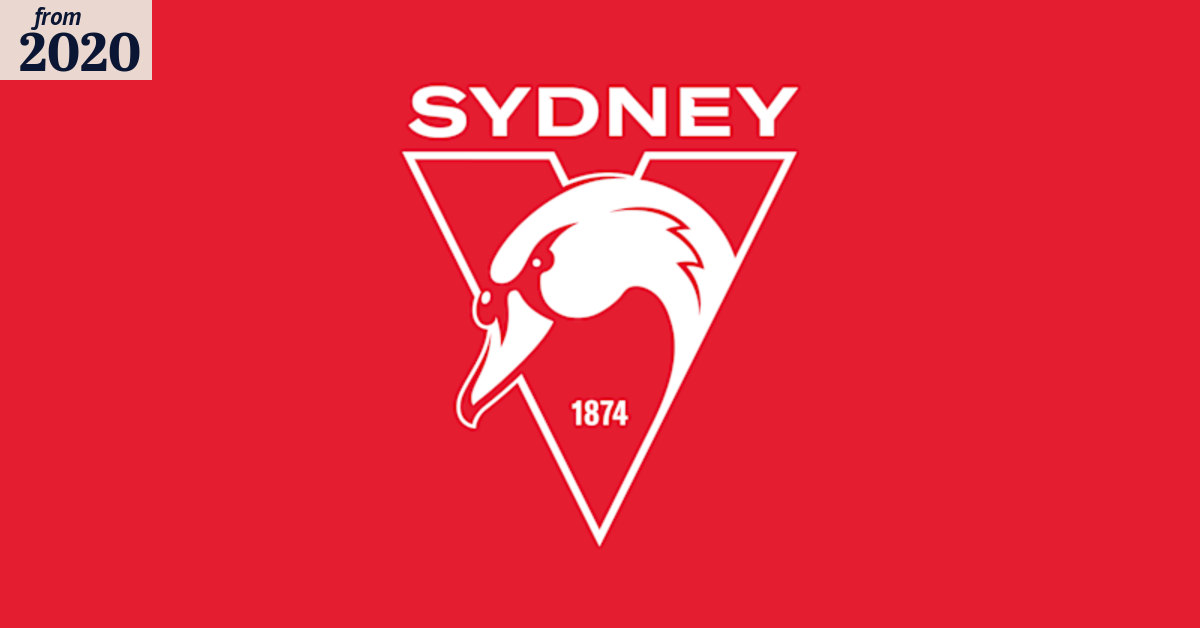
There is a move afoot to change the logo on the guernsey.
-
He reminds him of the guys, close-set, slow, and never rattled, who were play-makers on the team. (John Updike, seeing Josh Kennedy in a crystal ball) -
"The club spokesperson also said there will be no change to the Swans' guernsey, which has had the 'feathers' design at its heart since 1987." -
I like it. I like the more prominent swan and just saying "Sydney" instead of "Sydney Swans". I much prefer the swan itself - appropriately fierce looking. I like the prominent reference to 1874 (although see the history thread for whether this is the correct year for the club to be marking our inception - possibly should have been earlier). I appreciate the subtle homage to the formerly more prominent Opera House imagery. I'm not sure about the change in the red tone. Also, not sure about the font for the "SYDNEY" text. Overall, a thumbs up from me.All opinions are not equal. Some are a very great deal more robust, sophisticated, and well supported in logic and argument than others. -Douglas Adams, author (11 Mar 1952-2001)
Comment
-
-
Well that explains why we finished 16th this year, which was also 2 years in the making. Maybe Tom Harley was a bit distracted with more important things. I don't care all that much about our logo, but 2 years in the making? You could have given that assignment to a school kid to do in 5 minutes.Comment
-
I just watched the YouTube clip - yes, apparently some other things announced on 19 November.Comment
-
All opinions are not equal. Some are a very great deal more robust, sophisticated, and well supported in logic and argument than others. -Douglas Adams, author (11 Mar 1952-2001)Comment
-
Swans website: A new chapter"Unbelievable!" -- Nick Davis leaves his mark on the 2005 semi finalComment
-
Comment


Comment